Helloooo! Talking with Red made me want to make all of this again.
Hopefully someone will find this useful! And if not, that"s okay! c:
Note
If any images are broken, right click and Open Image In New Tab. Should work. :)
A big thanks to Redstars because, my gosh, we"ve picked up quite a few things from each other, and not to mention, I can talk with him about this stuff. o:
(And he makes super awesome signatures, just sayin".)
The Basics
You don"t have any idea how much I try to stress these simple rules! D8
[hr][/hr]
Save in .PNG
.JPEG / .JPG is HORRIBLE for quality!
[hr][/hr]
Get to Know Your Program
Don"t be afraid to fool around in it! Play around with some new features you"ve never touched before! If you find something you really like, go a bit more in-depth with that feature / filter / texture. Combine it with other techniques and see how that turns out!
(Messing around with filters is how I found the base of what I like to use!)
[hr][/hr]
Keep an Open Mind
Your first signature isn"t always going to be exactly what you imagined it to be. It takes practice (and an open mind) to create something you really, really like!
Also, if you can, talk with someone about this stuff! It really helps to get a second opinion!
[hr][/hr]
Try Different Resolutions / Banner Sizes
It"s a good idea to try different resolutions for your signatures. Some people work better with different resolutions!
If a render is too tall, try to make the banner taller! Sometimes, you should keep the size relative, though! (+ Height, + Length.)
Sometimes thin and long banners are pretty. Sometimes large banners do the trick!
[hr][/hr]
Use the Downloadables
Don"t look at Google Images for your backgrounds! Sure, it"s pretty at first, but you can make your own! The fact that you can adjust the background to your liking is a big plus! There are many, many sites and things you can grab to make your banner look real cool. ;D
Resources
Brusheezy
A HUGE collection of MANY, MANY brushes! Not to mention textures!
Starwalt Design Photoshop Brushes
A great collection of top notch brushes.
dafont
A massive collection of fonts, nicely sorted by styles. (Techno, Script, Gothic, Basic, etc.)
My Script Font
Make your own font! o: I made my own and it works quite nicely!
Zerochan
Basically art from anything and everything anime / cartoon related.
Great Pokemon Art
This dude is awesome at what he does. Just check the fella out!
A Massive Site for Renders
It"s in French, but there"s a lot of good stuff here. It shouldn"t be too hard to navigate!
Old Tutorial
Here"s an old tutorial regarding the basics of my style. :) I still use the whole Cloud / Watercolor as the base!
paint.net
Lots of nice plugins for paint.net here. c:
As for C4Ds, just google “C4D” or “C4D Render” and you should find some! (Thanks Red. 8D )
[hr][/hr]
Keep Adding and Experimenting
Sure. Maybe you"ve found the style you really feel at home with, but it"s not the end of the road! You can always add more things to it, take some out, etc. Slight variations can give you a different feel!
Maybe you"ve gotten used to someone else"s style. That"s okay! Make your own changes to it so you can make it your very own! (That being said, don"t copy them 100% all the time aha.)
[hr][/hr]
Layer By Layer Peeks
I use a few layers of brushes, backgrounds, and effects to finish it off. Here"s how they look from the bottom up!
Click on the finished banner for a fullsize.

[hr][/hr]

[hr][/hr]
Situational Tips / Explanations
I"ve picked out a few of my banners, added some arrows and circled some things. I"ll be explaining those areas. (They"re numbered! Look for the same numbered comment to read more about it!)

1. Text Location
I tried to place the text over a darker area of the banner so it would be easier to read. Make sure your text is readable as well! Keep it easy on the eyes. Light colors on darker backgrounds.
2. Stacking Brushes
This is just a thing I like to do when building up my backgrounds. I toss on a vivid light filter and adjust the opacity as needed. Try to use colors that match with the general color scheme of the whole banner. I stuck with blue and purple in this case. Also, try varying the brightness. It might come out nicely!
3. “Outer + Inner Glow”
I used an “Outer” and “Inner Glow” layer filter to give John that light violet outline there. Use it to make your render pop out a bit! It"s more subtle than “Drop Shadow” or something like that. You can always match the glow to your color scheme too.
4. Patterns
It might be a bit hard to see, but if you look closely, there are white stripes running horizontally across the banner. That"s an example of a pattern. You can find some off of the internet, or in my case, make your own! They can be used to give a banner a certain feel or texture.
[hr][/hr]

1. Text
Big Tip Here: White Text with a Black Outline can be read on ANY background of ANY color.
Since I had multiple colored backgrounds, I decided to go with that!
2. Background Colors
If you notice, they all have the same background, just in a different color. You can (and should) adjust the background to match your render! It"ll feel more connected if you do. ;o
[hr][/hr]

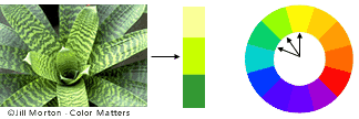
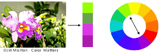
1. Color Choice
Color is a big part when it comes to making banners! Make sure your effects and background match up with the render! Use complimentary colors or analogous colors to your advantage! Different levels of brightness as well!
[Example taken from Basic Color Theory ]
Analogous Colors
Complimentary Colors
[spoilerSome Banners with Complimentary Colors /w Vivid Light:gp749oed]

[/details]
2. Extra Effects
In this case, I used a brush with some tasty hexagons to surround the Mew. I find that it directs the focus to the subject of the banner and the blue fits in quite nicely.
[hr][/hr]

1. and 2. Lighting
I find lighting a big part of my banners. Usually, I try to keep it consistent with the original render, but it usually doesn"t matter once you stack on the layers. For 1. I marked the lighter side of the background. That"s where the light is directed on the render. 2. marks the darker side, which we don"t focus as much on!
3. Text Placement
Again, make sure you choose your text colors wisely! White on dark backgrounds, black on light backgrounds!
[hr][/hr]
Requesting Notes
I don"t have a custom signature shop open right now, but! (Just something I want to get out!)
Why don"t you let people choose the backgrounds? Why only limited border selection? etc.
Because sometimes, things just don"t look right together. Sometimes people make good choices, but other times, not so much. Besides, a little bit of artistic freedom never hurt your signatures. aha.
Why no text color choices? Fonts? Character limit?
I usually stick with one or two fonts, but if you /really/ want something, I"m sure you could mention it somewhere! Text usually sticks to Black or White because they"re the easiest to read. The character limit is there because a paragraph of text doesn"t look all that nice on your signature. :(
[hr][/hr]
Update on 4-20-14

Mega Charizard Y (Test)
Used Brushes (In .ABR Photoshop Format):
(Download For) Audio Collage Brushes by Starwalt
(DeviantArt For) Sparkle Brushes by Metal-CX
Was searching for some nice new brushes to play along with. Layer by layer /w Explanations below.

[hr][/hr]
Subject to editing in the future! Hope you"ve taken something from this! Comments appreciated. c:
