I’m willing to share my thoughts, advice, and whatnot of any maps you want me to see.
(Hopefully it helps you.)
How It Works:
I’ll be drawing on your map via Photoshop. Circling / Highlighting certain parts. It’ll be color coded.
Ex: Lake Highlighted Red. Comment after the Red Squiggle will be about the lake.
If I don’t have anything to say because your map is so gosh darn good, I’ll draw a Luxray on it or something. xD
Just post your map(s) and if you want me to PM my reply to you, just say! Otherwise, I’ll be posting it here.
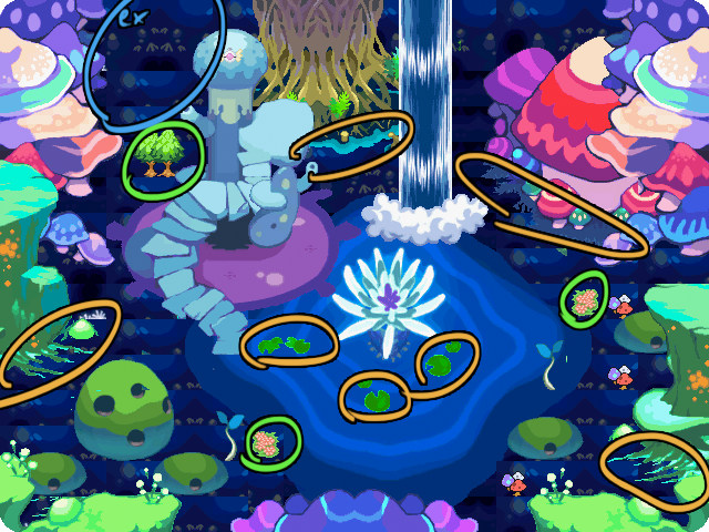
Yellow
The issue with these tiles is that their edges are far too bright and look pixelly / JPEG worthy on a dark background like the undersea tiles. I’d suggest taking out the lily pads and finding something to cover the rest up. Bushes and rocks would seem fitting, try to find some that don’t have the bright pixel edge. Check Tileset 7’s lower half. (The one with all the overworld tiles.)
Green
These just look a bit out of place to me. (Not to mention they’re pretty bright.)
Blue
(Just one example.)
There’s a lot of the (clipping?) odd, broken ground layer. If you can find a solid color to replace them, great. I don’t know if there’s a tile like that, though. If not, just make sure the tiles connect to each other nicely and use something to cover it up if it doesn’t work out.
Other
There are some stray sea green pixels near the sprout in the middle right and the swiss-cheese-moss-rock on the left, but it’s barely noticeable.
I reaaaaaaally like the choice of tiles and placement of the larger structures, though! With a little bit of brushing up, this place could be even cooler. 0:
Okay. I really like how this looks so far. I think a few small tweaks, and it’ll look just fine! 8’)
TLDR
Move trees.
Move grass off of paths.
[hr][/hr]
Yellow Green
Tree #1: Move the tree 1 tile up. I don’t like it when trees are on the same row / column and are close to each other.
Move the trees so that their leaves aren’t clipping on the cliffs? It looks kinda awkward.
Edit: I forgot to circle the evergreen tree above tree #1, but you might move that one too. Its leaves are on the cliff edge.
[hr][/hr]
Green
What happened to the dark jungle grass? A corner tile is missing, I think.
[hr][/hr]
Blue
Keep the grass off of the path edges. For the grass on the path on the right, you might want to take that out completely. Try to keep the grass in some sort of natural formation, not a two tile thing on the edge of town.
[hr][/hr]
Red
I think it would be better if the jungle grass was not on the paths. The sides look too repetitive and it just looks kinda out of place. Why don’t we keep it on the grass?
This is my mapping contest entry. I didn’t get to finish it, but I’ll probably keep it after the mapping contest. Don’t hold back. owo I noticed that last one was months ago so if you can’t do it, that’s fine.
EDIT: If you don’t mind, could you do this one too? That is if you’re still doing these. owo
I’m planning on expanding the second one and making different little areas, that one is the swampy, forest-ish area.